

Company
SVSU Cardinal Solutions - SVSU Wellness
Role
Product Designer
Tools
Figma and Miro
DAte
Aug 2024 - Jan 2025
Deliverables
Design Assets: Sitemap, wireframes, and high-fidelity prototypes, Usability Research, Sketches/Wireframes, User Flow Diagrams, UI Style Guide, Design Systems/Assets Hand-offs, Interactive Prototypes, and High-Fidelity Mock-ups.
Research Findings: Conducted Surveys, think-aloud protocols, personas, and journey maps.
UX Report: Consolidated insights, decisions, and results.

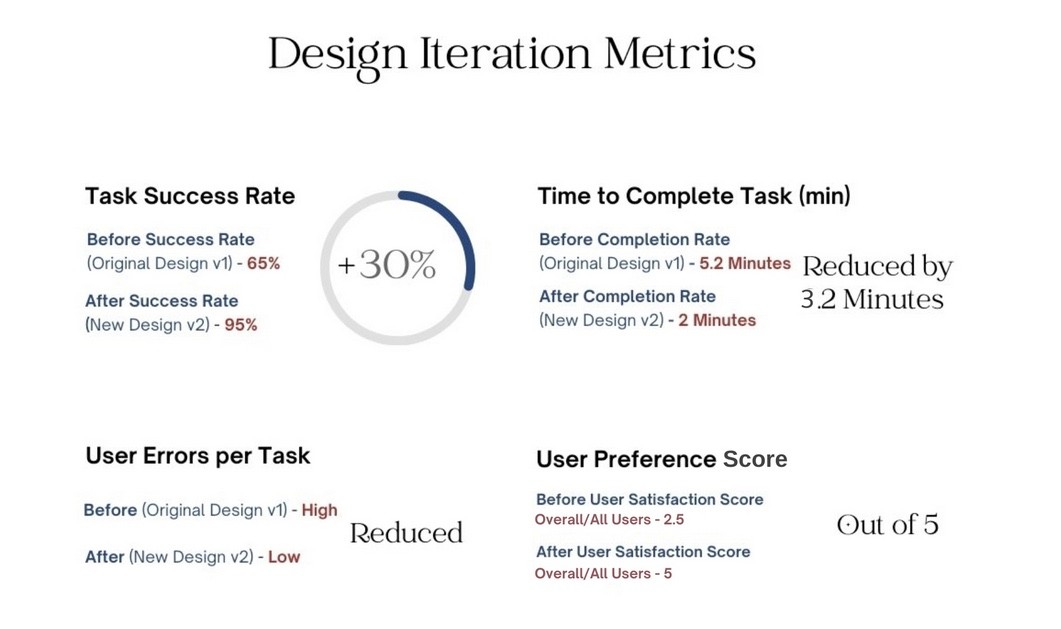
2 mins
Average Completion Time
Reduced from 5.2 minutes by grouping exercises and improving navigation clarity.
95%
Task Success Rate (+30%)
Increased from a 65% baseline after simplifying the routine-building flow.
5/ 5
User Preference Score
Self-reported satisfaction during testing, doubling the original score of 2.5.
Discovery
01 — Discovery
The Problem: Understanding the Gap in Wellness Support
In my insightful conversation with Associate Professor of Kinesiology, Gena D. Guerin, it became evident that students were facing a significant obstacle: they lacked a structured and accessible tool to help them effectively navigate wellness challenges and prepare for their future careers.

How Might We
Define & Identify
02 — Define
Bridging Kinesiology and Personal Growth
Currently, there is no reliable platform that addresses the academic and career aspirations of Kinesiology majors while also supporting non-majors on their wellness journeys.
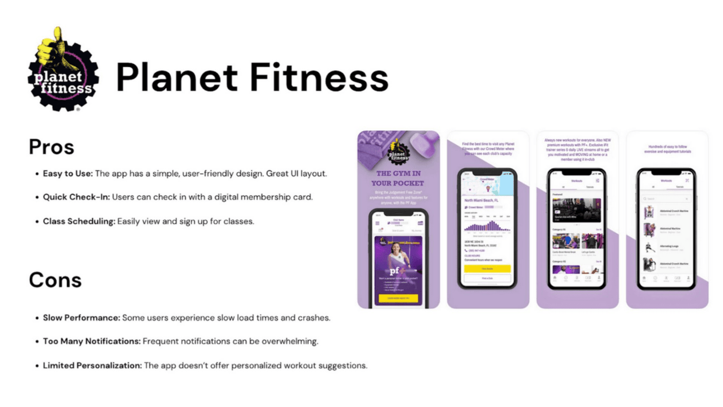
As students strive to stay informed about the latest wellness resources and integrate them into their daily lives, I started by investigating the wellness app industry to assess how well current products support their well-being.
This gap represents a unique opportunity to create a space where students of all backgrounds can thrive, enhancing their physical and mental well-being together.



After getting first hand accounts of the users, I meticulously recorded and transcribed each session to create detailed personas and a comprehensive journey map, highlighting critical problem areas, insights, and actionable opportunities.
The completed journey map provides a clear visual narrative of the user’s current experience, allowing us to synthesize pain points into our key design findings.


Insight
By researching deeper into the problem it was revealed that students struggle to build healthy habits because most wellness apps feel generic and completely disconnected from their academic lives.
Without a centralized tool that ties physical and mental well-being directly to their coursework, students lose motivation, leading to frustration and low app adoption.

Goals
New Approach: How Might I Create a Platform to Connect Career-driven Kinesiology Students and the rest of SVSU Student Body Seeking to Start or Maintain Their Wellness Journey?
Ideate
03 — IDeate
Information Architecture
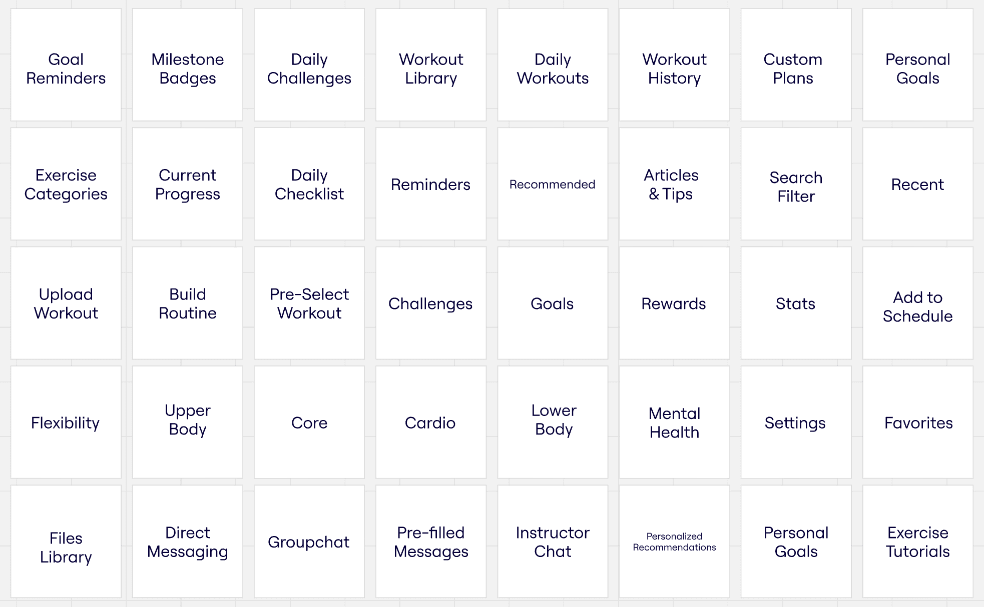
With this approach in mind, I conducted a card sorting exercise with six users, two from each target market, to organize the app’s information architecture.
Through this exercise, users identified that features like “Goal” could fit into multiple categories, including “Home”, “Profile”, and “Rewards”, emphasizing the importance of a flexible, cross-functional design drawing from the insights gained in the card sort usability study, crafted a sitemap that effectively translates user needs into a organized layout.
To enhance clarity, I differentiated features that previously coexisted, such as settings and goals, ensuring that users can navigate with ease and confidence.




Test
04 — Test


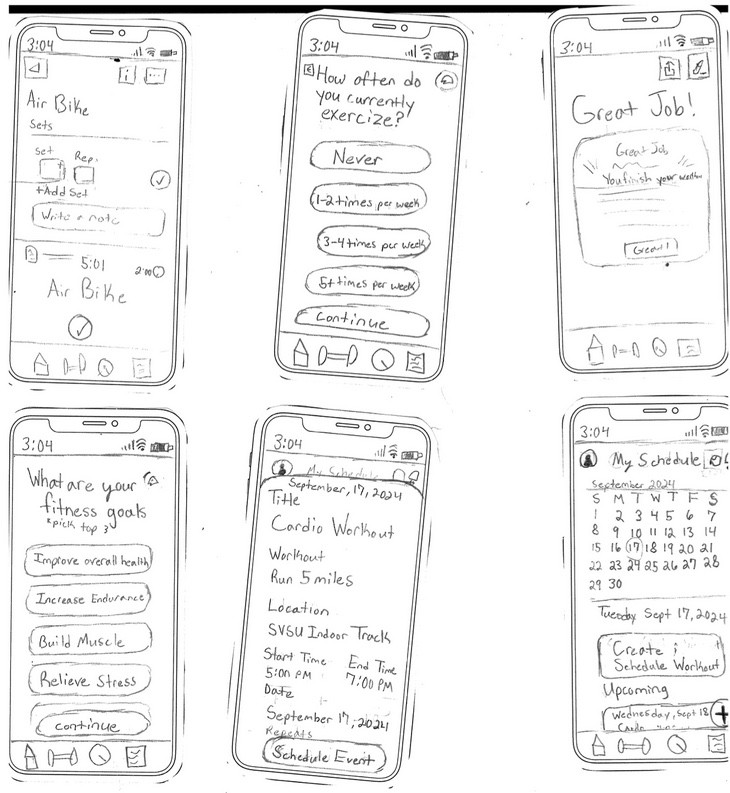
I grew to understand that complexity is often a structural problem, not a visual one; my growth as a designer came from prioritizing the architectural integrity of the IA first, using Card Sorting to resolve confusion and ensure logical, predictable navigation.
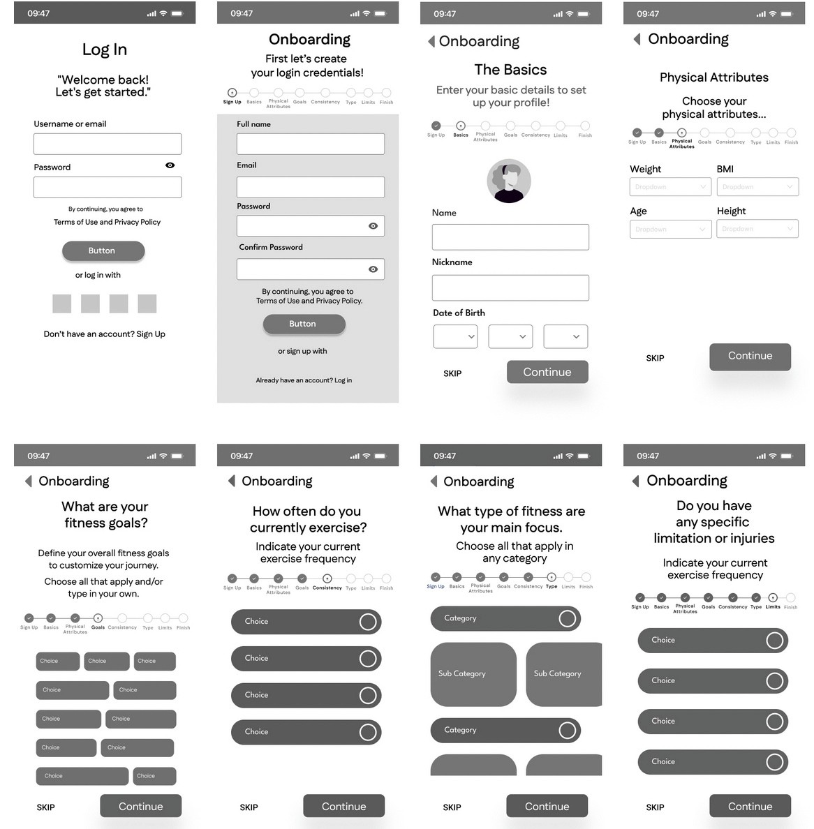
My philosophy shifted to “Clarity drives Confidence,” meaning I learned to prioritize low-friction experiences by strictly applying progressive disclosure to break down complex tasks (like the workout flow), which is critical for turning infrequent users into engaged, consistent users.
I realized the full strategic value of the “finish line” in a flow; my design growth showed me that completion screens must be actionable and personalized (like the Daily Checklist) to drive essential habit formation and retention, not just signal the end of a task.