

Project
Furrwise Mobile App
Role
Product Designer
Tools
Figma, Figjam, and Miro
Date
Spring 2026
Context
Context
Context
01 — Context
Problem
Pet owners often struggle to find reliable, personalized health guidance, especially during urgent situations.
Existing resources can feel generic, overwhelming, and disconnected from a pet’s breed, symptoms, location, and access to affordable care.
Purpose
To address this, I created Furrwise, a mobile app that helps dog and cat owners find personalized health guidance, nearby veterinary care, and everyday wellness resources in one place.
This case study explores how I used systems thinking and a scalable design system to create a cohesive pet-health app with clear information, consistent components, and easier-to-use care guidance.
Design Challenge
Design Challenge
How might we create a cohesive, scalable pet-health app that gives pet owners clear, personalized guidance and easier access to veterinary care, wellness resources, and urgent support?
How might we create a cohesive, scalable pet-health app that gives pet owners clear, personalized guidance and easier access to veterinary care, wellness resources, and urgent support?
1) Contextual Search & Filtering
1) Contextual Search & Filtering
Real-time map sorting optimized for urgent care needs.
Real-time map sorting optimized for urgent care needs.
2) Swift & Accurate AI Diagnosis
2) Swift & Accurate AI Diagnosis
Rapid, health-focused symptom analysis for immediate emergency routing.
Rapid, health-focused symptom analysis for immediate emergency routing.
3) Dynamic Data Capture
3) Dynamic Data Capture
Seamless multi-variable inputs for complex breed profiles.
Seamless multi-variable inputs for complex breed profiles.
Design System
Design System
Design System
02 — Typography, Colors, Components, variables, etc.
To ensure the product could scale while maintaining a cohesive user experience, I established a comprehensive design system. The goal was to build a foundation that prioritizes rapid comprehension and accessibility during high-stress, urgent pet care situations, while still feeling approachable for everyday wellness.
To ensure the product could scale while maintaining a cohesive user experience, I established a comprehensive design system. The goal was to build a foundation that prioritizes rapid comprehension and accessibility during high-stress, urgent pet care situations, while still feeling approachable for everyday wellness.
1) Typography
1) Typography
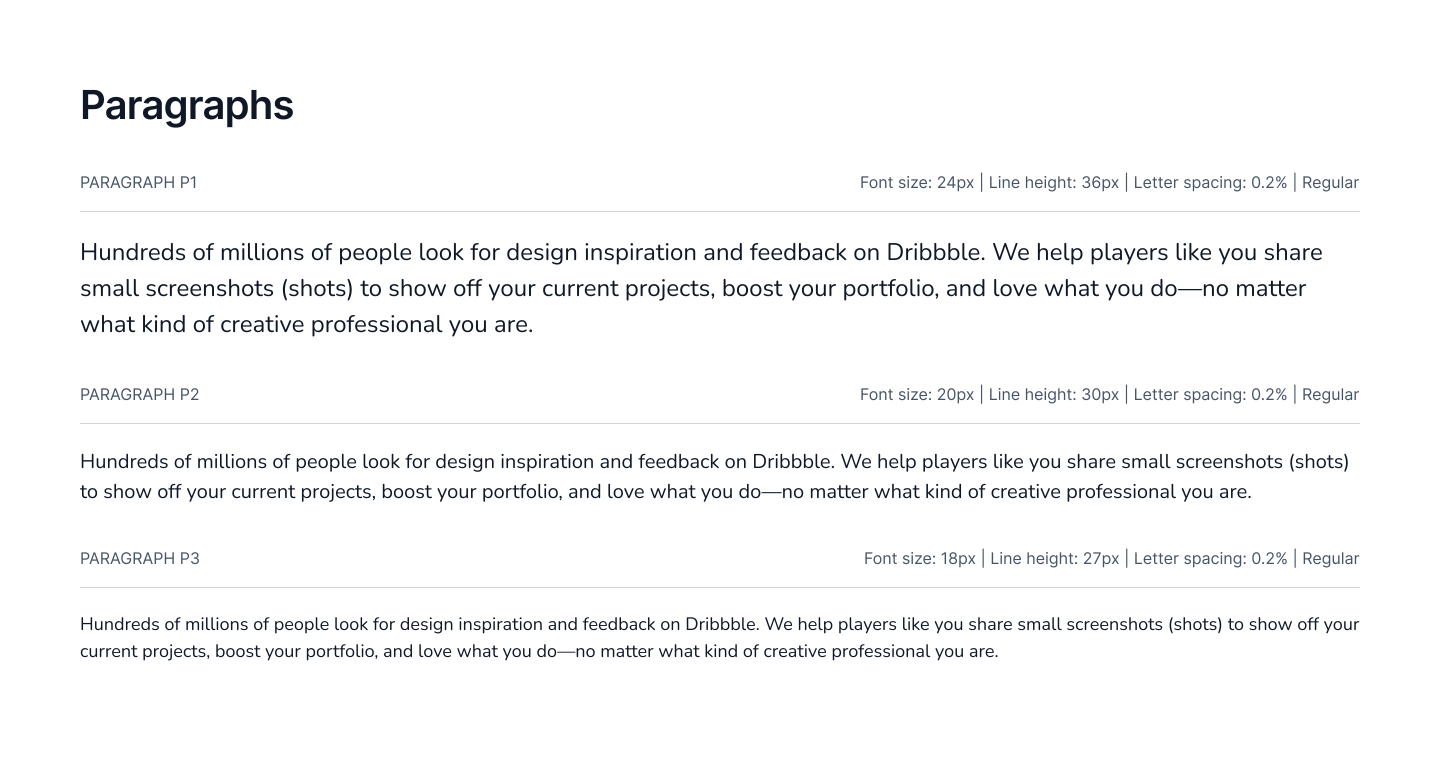
Rationale: Emergency and health UIs demand instant readability, especially since users may be panicked or physically tending to a pet. Legible typography directly impacts decision-making speed, while the tone of the typeface can help alleviate anxiety.
Balsamiq Sans was chosen as the primary font to bring a warm, approachable, and playful personality to headings, labels, and buttons.
Nunito was chosen as the secondary font to ensure clarity and reading comfort across denser body text, such as step-by-step medical guidance or clinic details.
Rationale: Emergency and health UIs demand instant readability, especially since users may be panicked or physically tending to a pet. Legible typography directly impacts decision-making speed, while the tone of the typeface can help alleviate anxiety.
Balsamiq Sans was chosen as the primary font to bring a warm, approachable, and playful personality to headings, labels, and buttons.
Nunito was chosen as the secondary font to ensure clarity and reading comfort across denser body text, such as step-by-step medical guidance or clinic details.



2) Color System
2) Color System
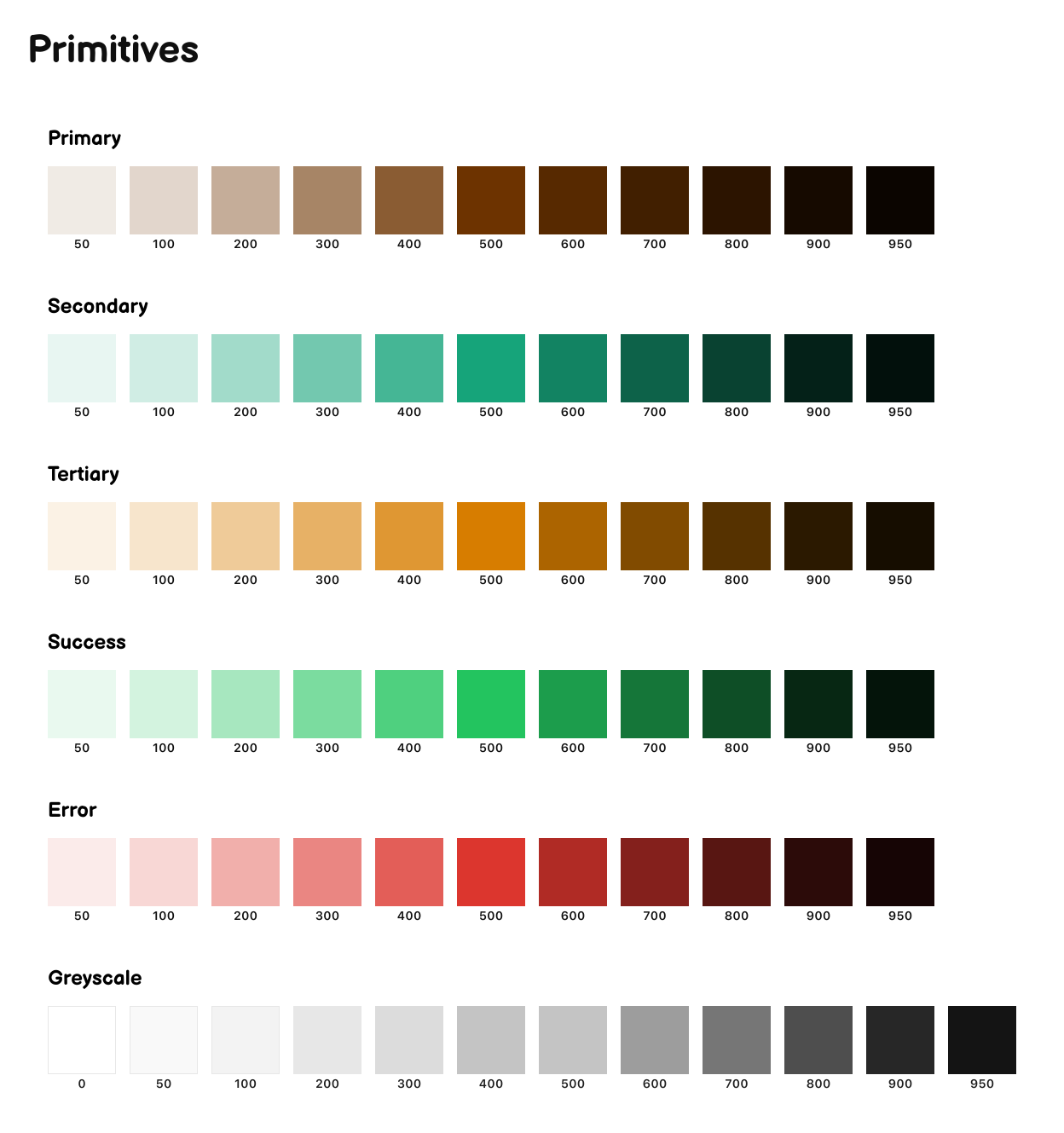
Rationale: I developed a color palette strictly meeting WCAG standards to ensure adaptive accessibility. I tokenized the palette in Figma across Primary (Browns), Secondary (Teals), Tertiary (Oranges), Success, Error, and Greyscale ranges. This was structured using a 3-layer system:
Primitives (raw values from 0 to 950)
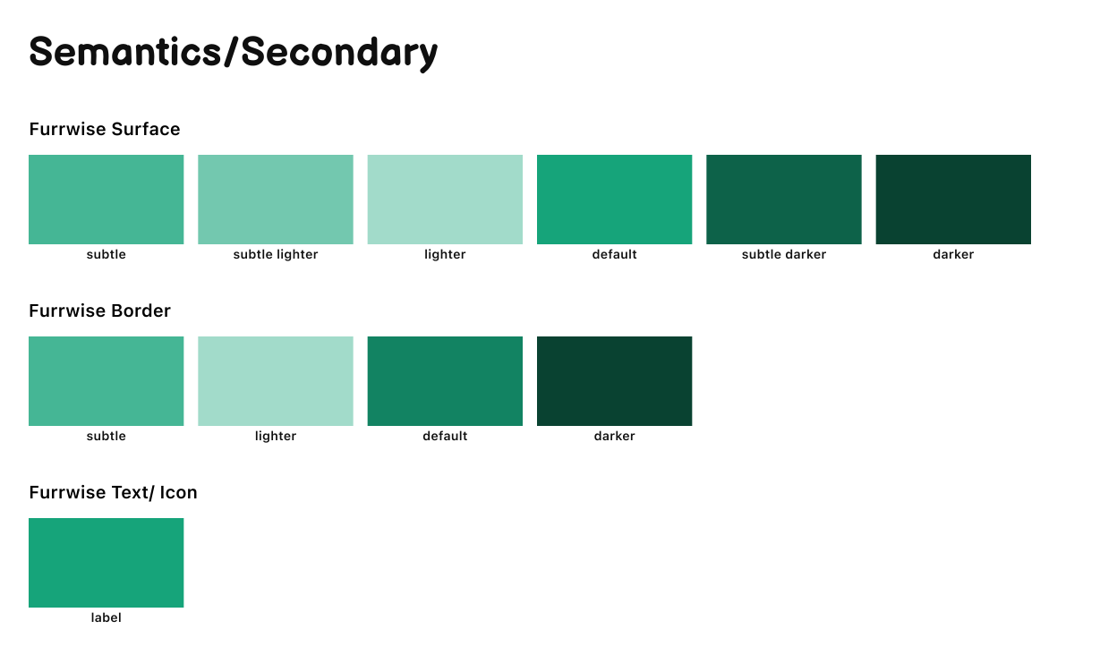
Semantic roles (e.g., Surface, Border, and Text/Icon labels mapped to subtle, default, and darker states)
Mode-aware tokens that adapt automatically
Rationale: I developed a color palette strictly meeting WCAG standards to ensure adaptive accessibility. I tokenized the palette in Figma across Primary (Browns), Secondary (Teals), Tertiary (Oranges), Success, Error, and Greyscale ranges. This was structured using a 3-layer system:
Primitives (raw values from 0 to 950)
Semantic roles (e.g., Surface, Border, and Text/Icon labels mapped to subtle, default, and darker states)
Mode-aware tokens that adapt automatically



3) Atomic Design
I structured the interface using the Atomic Design methodology:
Atoms: Buttons, icons, and input fields
Molecules: Inputs paired with labels, buttons combined with icons
Organisms: Clinic cards and navigation bars
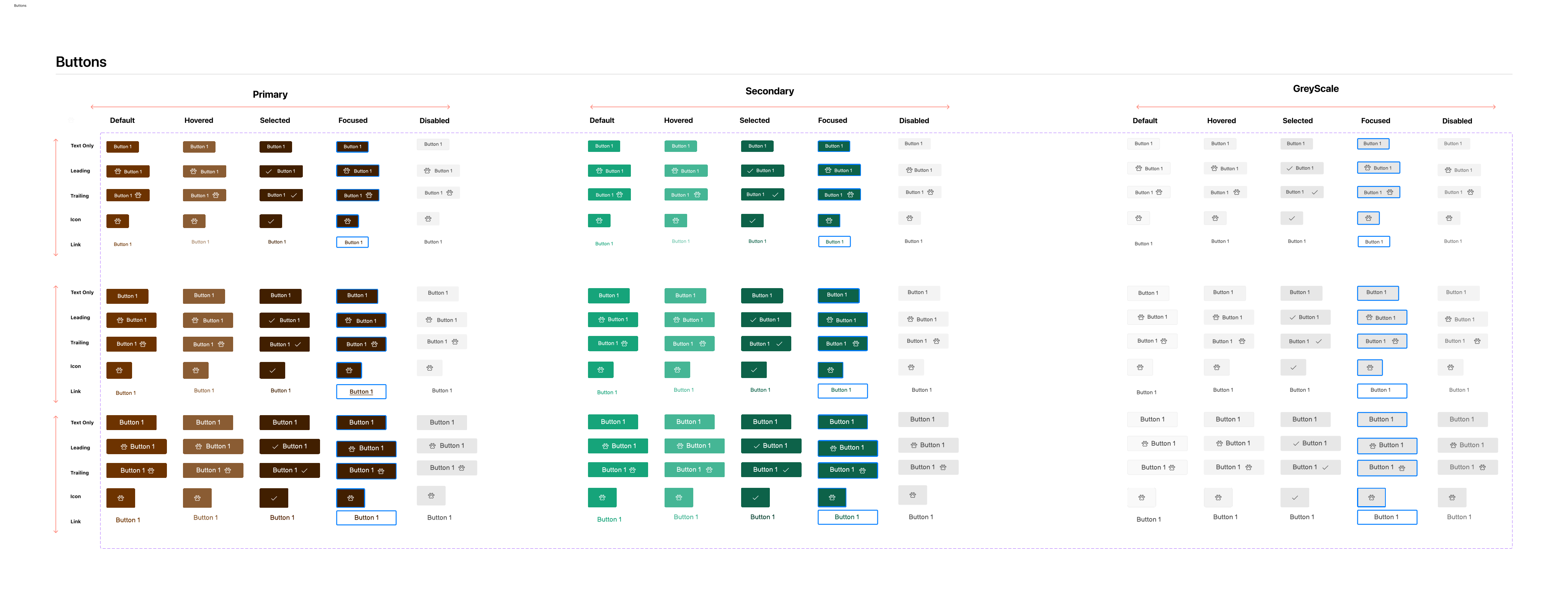
Buttons Matrix: I developed a comprehensive button component matrix covering Primary, Secondary, and Greyscale variations. Each button was built to support multiple interactive states (Default, Hovered, Selected, Pressed, and Disabled).
Shared Components: All components were created within a shared Figma library, following clear naming conventions and documentation best practices for seamless collaboration and reuse.
I structured the interface using the Atomic Design methodology:
Atoms: Buttons, icons, and input fields
Molecules: Inputs paired with labels, buttons combined with icons
Organisms: Clinic cards and navigation bars
Buttons Matrix: I developed a comprehensive button component matrix covering Primary, Secondary, and Greyscale variations. Each button was built to support multiple interactive states (Default, Hovered, Selected, Pressed, and Disabled).
Shared Components: All components were created within a shared Figma library, following clear naming conventions and documentation best practices for seamless collaboration and reuse.
4) Design Tokens & Variables
I leveraged Figma variables to define essential design tokens such as color-primary and font-heading. This setup enables seamless, real-time theme switching between dark and light modes, a crucial accessibility feature for pet owners who might be navigating the app during late-night emergencies.
It also allows for global updates across the entire Furrwise design system. By centralizing these key styles, users can easily customize their viewing preferences while ensuring strict visual consistency throughout the interface.
I leveraged Figma variables to define essential design tokens such as color-primary and font-heading. This setup enables seamless, real-time theme switching between dark and light modes, a crucial accessibility feature for pet owners who might be navigating the app during late-night emergencies.
It also allows for global updates across the entire Furrwise design system. By centralizing these key styles, users can easily customize their viewing preferences while ensuring strict visual consistency throughout the interface.

Furrwise Design File
Furrwise Design File
Furrwise Design File
03 — Design Brief, Typography, Colors, Components, Light & Dark Mode Prototype
Prototype
Prototype
Prototype
04 — High Fidelity Prototype
My Takeaway
My Takeaway
My Takeaway
05 — Reflection
Leveraged advanced Figma features (such as design tokens, interactive variants, and atomic components) to build a scalable and highly consistent UI system tailored for high-stress pet care scenarios.
This project was highly recognized for its architectural depth, WCAG-compliant accessibility, and sophisticated execution of seamless theme switching across dark and light modes.
Leveraged advanced Figma features (such as design tokens, interactive variants, and atomic components) to build a scalable and highly consistent UI system tailored for high-stress pet care scenarios.
This project was highly recognized for its architectural depth, WCAG-compliant accessibility, and sophisticated execution of seamless theme switching across dark and light modes.